Workspace Studio
- Duration
- Ongoing
- Team
- Solo product build
- Role
- Product Design Engineer
Building a portfolio for every new idea meant repeating the same setup: content, templates, previews, and release decisions.
Workspace Studio brings those pieces into one reusable workspace, so I can shape the story, review the real result, and publish with more control.
Value: less repeated setup, clearer ownership, and safer release.
The problem
I kept making new portfolios for myself and helping clients launch theirs. Every version brought a new visual direction, rewritten content, and another implementation of the same foundations. The creative part was energizing; repeating the setup was time-consuming and became harder to maintain as the code and content aged.
I moved the content into Contentful so it could act as a shared source of truth. That helped, but the interface was still a separate build. Even a small change meant moving between content, components, and deployment.
When AI became practical, I wanted visitors to ask about my resume, projects, and experience in their own words. Early retrieval experiments showed that the assistant could be useful, but the question had to travel through several services before it could reach the right content. Each handoff added moving parts and delay.
The real problem was larger than adding chat. I needed a portfolio system that could be edited, reviewed, and reused without starting over each time.
What I built
Workspace Studio is a small content and preview layer between an author and the finished site. A workspace holds the story, media, template choice, preview, and publishing status in one place.
In practical terms, it gives someone a strong starting point instead of an empty repository. They can create a personal portfolio, a business landing page, or another focused site, then change the content without rebuilding the interface around it.
The engineering scope is intentionally focused: one shared content model, a set of distinct template families, a private preview, and a clear release boundary. That is enough to make a new site feel authored without rebuilding the platform each time.
Choose a direction
The Studio starts with a family of templates rather than a blank page. Each family has its own character, so a product portfolio can feel different from a business site while both use the same underlying workflow.
The shared foundation covers the parts that should not need to be rebuilt: content editing, media, preview, draft visibility, and release checks.
Value: a clear starting point without giving up creative direction.
Keep content and presentation separate
The content describes the work; the template controls how that work is presented. This means I can revise a case study, swap a project, or change the story without rewriting the whole interface.
The design sheet makes the boundary visible: what can change, what should stay consistent, and how important states should behave. It gives future templates a shared set of decisions to build from without making them look identical.
Value: more freedom for the author, with fewer decisions to rediscover or maintain.
Make the template inspectable
Each template has a design sheet: a compact reference for its typography, colour roles, layout, navigation, motion, and important states. It makes the intended experience easier to review before the template is used in a real workspace.
The sheet also has a small On this sheet index. Those links jump directly to the relevant part of the reference, so a designer, engineer, or reviewer can find the decision they need without scanning a very long page.
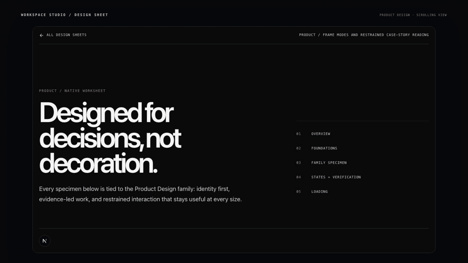
The design sheet is also a handoff tool. It gives future templates a shared quality bar without forcing them to look the same.
Value: clearer decisions before implementation, and fewer details to rediscover later.
See the system across templates
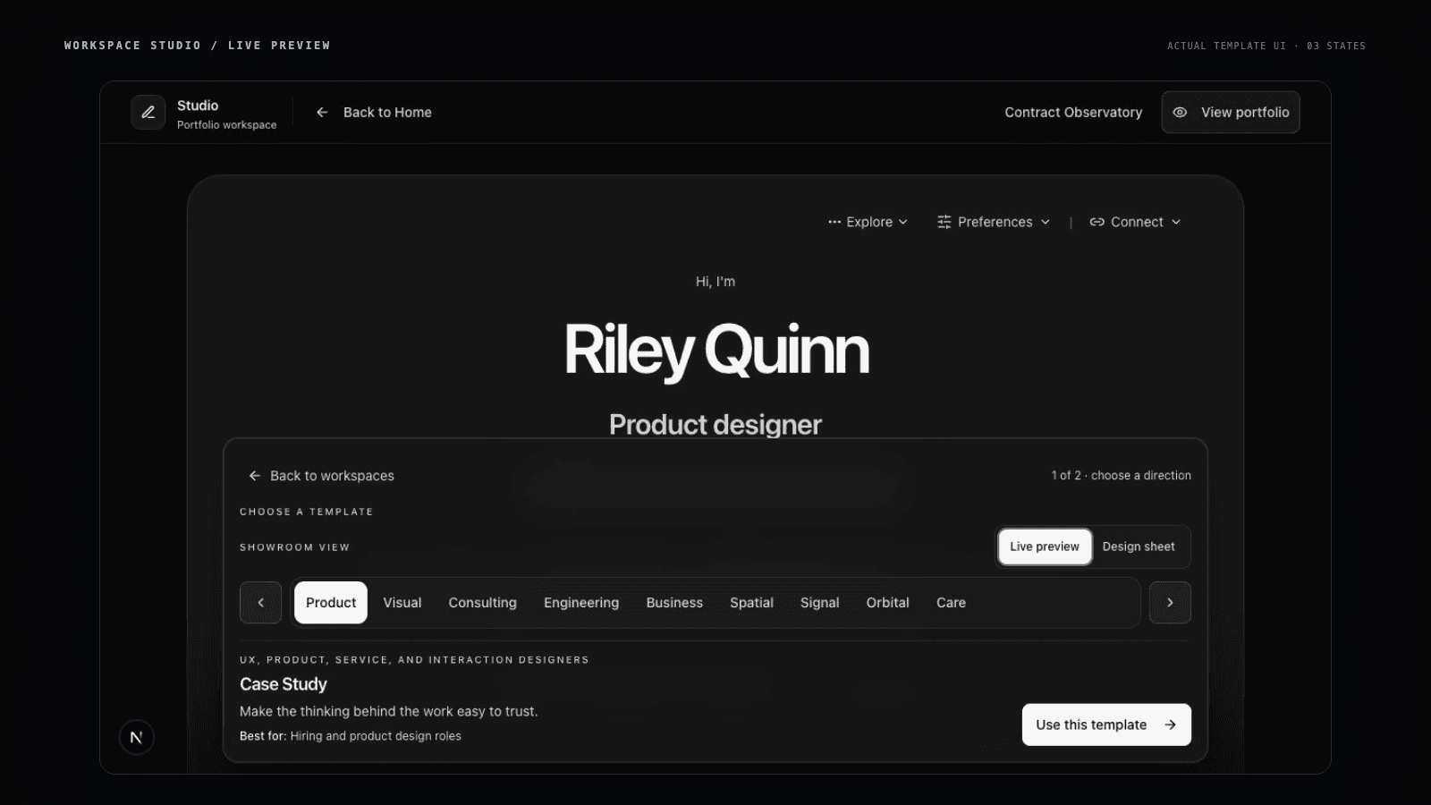
The template walkthrough uses the real Studio previews to move through Product Design, Visual Storyteller, and Orbital. It shows the difference between a shared system and a collection of identical themes: the workflow stays consistent while each template keeps its own character.
Review before release
The private preview stays close to the public site, so I can review the real experience before publishing it. A project can remain a draft while it is being shaped, appear in Studio and private preview, and stay out of the live portfolio until it is ready.
This makes the system useful beyond a personal portfolio. A designer, small business, or team can use the same workflow to create a focused web presence without beginning with an empty repository, a purchased theme, and a separate content system.
Value: clearer decisions, safer publishing, and a reusable foundation for different kinds of sites.
AI that stays in context
Retrieval-augmented generation, or RAG, is a simple idea: before the assistant answers, it looks up the most relevant parts of the workspace content. It uses that material to form a response instead of guessing from a blank page.
The Studio treats this as an optional feature. When enabled, each workspace has its own assistant context, built from that workspace's approved content. A business workspace should not mix its information with a personal portfolio, and the assistant should politely decline questions outside the work.
The important lesson was that better chat is not only about the model. It also depends on having a clear content boundary, a short path to the source material, and a useful answer when the question is in scope.
Value: richer conversations without giving the assistant permission to invent a broader story.
Quality before release
Accessibility was part of building the system, not a final polish pass. I checked keyboard navigation, visible focus, readable spacing, 44px touch targets, predictable menus, reduced motion, narrow screens, and useful empty states.
The goal was practical: make the templates easier to use, easier to review, and easier to trust. This is a strong product review, not a formal WCAG certification.
Value: more people can use the work, and quality is considered before release.
What changed
- One reusable foundation can support a personal portfolio or a business site.
- Content can change without rebuilding the interface around it.
- Drafts can be reviewed privately before they are published.
- Templates share maintainable rules while preserving their own character.
- AI is optional, scoped to one workspace, and able to decline unrelated questions.
- The workflow is easier to explain, review, and hand off.
Tools and approach
The Studio uses familiar web tools: Next.js, React, TypeScript, CSS, shadcn/ui building blocks, Motion, and local Markdown and JSON files.
Contentful, Pinecone, and Flowise were important experiments while I worked out the content and AI experience. The current direction keeps local workspace content at the centre and treats hosted retrieval as optional.
The important choice is not any one tool. It is keeping the content, template, preview, and publishing decisions close enough together that they can be understood and changed over time.
What I learned
- Reuse is valuable when it shares the foundation without erasing the character of each template.
- A content system should remove repeated work, not become another layer to maintain.
- AI is more useful when it has a clear job, relevant source material, and visible limits.
- Authoring and review need to be designed together.
- Accessibility surfaces quality issues early instead of hiding them until the end.
Next step
Make new workspaces easier to start, easier to hand off, and easier to publish. The next extension is to make more content blocks swappable too—different list, callout, timeline, and media treatments that can change without rebuilding the story. The long-term goal is a system where someone can choose a direction, shape the content, and release a quality site without needing to understand the repository behind it.