CREA Stats Application Redesign
- Duration
- 10 months
- Team
- 3 designers, 4 developers, 2 product managers
- Role
- Product Design Engineer · Lead UX/UI Designer & Frontend Developer
The thesis: CREA Stats was a product transformation where design and frontend engineering were part of the same problem-solving process. The challenge was not only how market information looked, but how editorial content, chart definitions, datasets, and reusable interfaces worked together.
My role: I worked across UX/UI design, information architecture, component and design-system work, and frontend implementation with React, GatsbyJS, GraphQL, Contentful, HTML, CSS, JavaScript, and Git.
The problem: The existing platform had inconsistent experiences across more than 70 boards, incomplete or difficult-to-maintain pages, and no flexible way to connect market stories with the right visualizations.
The outcome: The work produced a more consistent publishing and chart-delivery system, a reusable component architecture, and a build process reduced from 20+ minutes to under 2 minutes. The guiding principle was simple: the complexity of the system should not become the user's complexity.
Project Overview
CREA Stats helps people access and interpret Canadian real-estate market information. The product had to serve two connected experiences: people reading market stories and the editors managing the content, categories, boards, and visualizations behind those stories.
The original creastats.ca was hand-coded in HTML/CSS with JavaScript sprinkled in Dreamweaver. Over time, inconsistencies across pages created UX breaks and made the platform difficult to manage and scale. The redesign had to make the reading experience clearer while giving the product a stronger system underneath it.
The important design problem was the handoff between editorial context and the generated chart—not just the appearance of the final page.
The Situation
CREA needed to publish market stories and supporting information across more than 70 real-estate boards. A story needed the right context, category, and chart, while the presentation layer needed to keep the experience coherent as the product grew.
That made this both an information-experience problem and a product-architecture problem. A flexible editorial model that produced inconsistent interfaces would still fail readers. A polished interface that required manual rebuilding for every new story would fail the people maintaining the product.
The Problem Behind the Interface
The visible issues—broken or incomplete pages, inconsistent patterns, and difficulty adding new information—were symptoms of a deeper connection problem:
- Editorial content and presentation were too closely tied together.
- Market context and data visualizations needed a clearer relationship.
- Repeated experiences across 70+ boards needed reusable patterns rather than one-off fixes.
- The system had to become easier to evolve without making the reading experience more complicated.
The goal was not to hide the system. It was to make the system do more of the work so the user could focus on the market information.
My Role
I worked with a team of three designers, four developers, and two product managers. My role connected UX/UI design with frontend engineering: research, ideation, usability testing, information architecture, component design, and implementation.
That overlap mattered because design decisions were also implementation decisions. The way a story was structured affected the content model. The way a chart was selected affected the information architecture. The way components were defined affected consistency across boards and the cost of future changes.
Designing the Experience
The experience started with the information people needed to understand: what market story they were reading, which board or category it belonged to, and which chart helped explain it.
I used research, ideation, and usability testing to work through the existing pain points, then applied Atomic Design and Component-Driven Development to turn repeated interface decisions into reusable patterns. The design-system work included collaboration with the UX team using Figma, Bit.dev, Storybook, HTML, Tailwind CSS, and Git.
The intent was not to create a new visual layer for every board. It was to establish a consistent vocabulary that could support different market stories without making readers relearn the product.
Engineering the Experience
The frontend architecture connected a Gatsby presentation layer with structured Contentful content through an API. Contentful held the editorial structure and market context, while a mapped file system paired that content with the chart definitions and datasets needed by the frontend.
This separation gave the product a clearer relationship between content and presentation. Editors could work with the information structure, while the frontend could render reusable experiences instead of rebuilding each page from scratch.
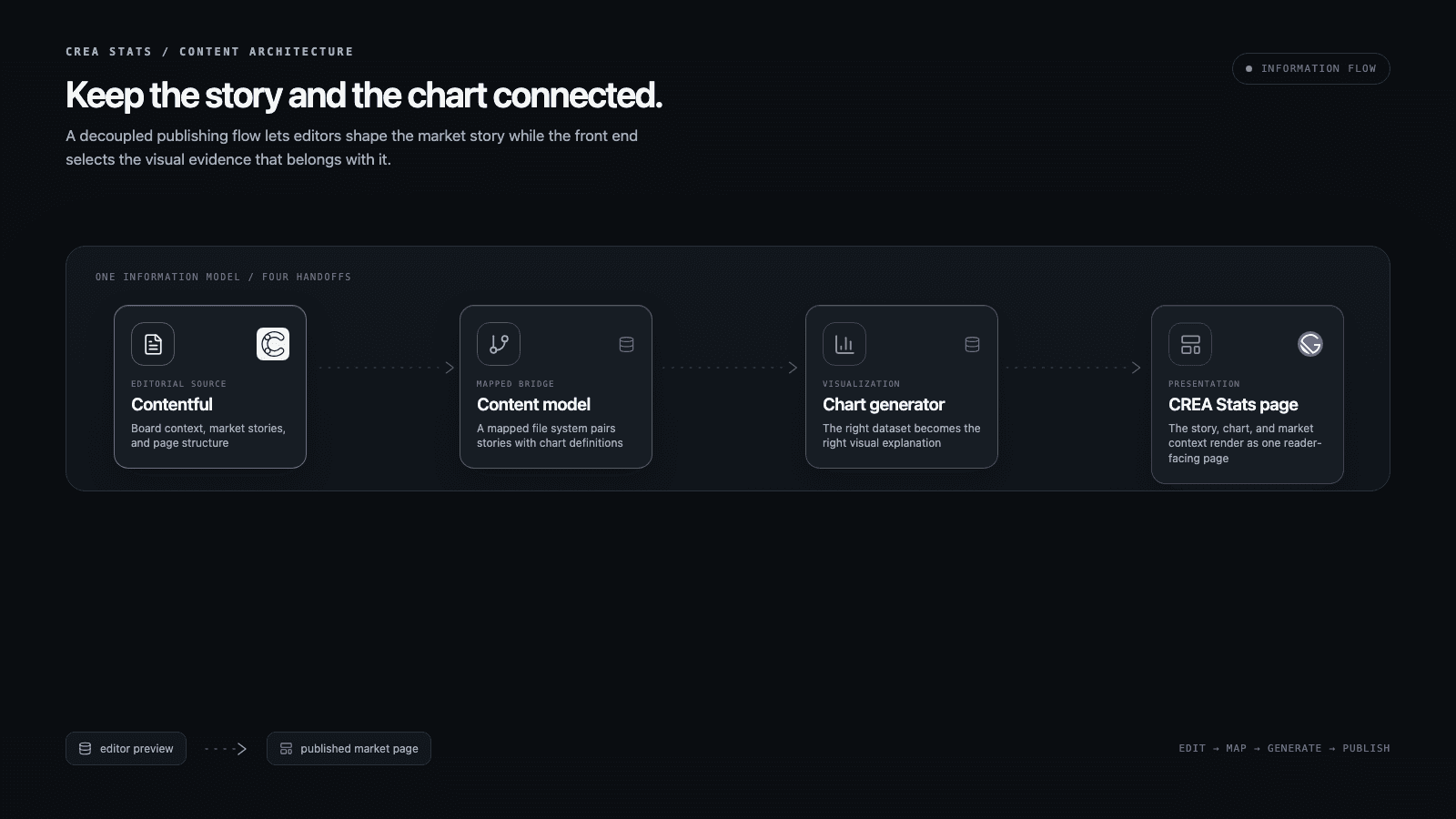
The Gatsby presentation layer connected to Contentful via API and used Gatsby Cloud for build and deployment. Performance was part of the product experience and the operating model: moving assets to an internal server reduced build time from 20+ minutes to under 2 minutes.
Where Design Met Engineering
The strongest decisions sat between the interface and the system behind it.
Consistency across 70+ boards
The scale of the board network made one-off page fixes expensive and difficult to maintain. Reusable components and a design-system proof of concept gave the team a shared way to express common interface patterns, so consistency could be designed and implemented together.
Editorial flexibility without interface drift
CREA needed to manage market stories and supporting information without treating every page as a separate build. Structured Contentful models separated editorial content from the presentation layer, while the component system kept that flexibility from turning into a different interface for every story.
Data experience through content architecture
A market story is not useful without the right explanation and visualization. The architecture connected board context, category, chart definitions, and datasets so the presentation layer could pair a story with the chart intended to help the reader understand it.
Performance as a design condition
Build time affected more than engineering convenience. It affected how quickly the team could review, correct, and publish the experience. Reducing the build from 20+ minutes to under 2 minutes made the product easier to evolve while also reducing friction for the people maintaining it.
Challenges and Tradeoffs
- Legacy system integration: Modernizing the architecture while working with existing data structures and workflows.
- Content migration: Moving historical information while maintaining data integrity and access.
- Flexible content versus consistent output: Giving editors room to manage market stories without letting every story become a bespoke interface.
- Performance under complexity: Handling statistical data and visualizations while keeping the build and delivery process practical.
- Transition: Introducing a more consistent system without losing the visual continuity of the existing product.
Outcomes
Experience: A more consistent way to connect market context, editorial content, and visualizations across the product.
Content operations: A structured publishing and chart-delivery workflow that separated editorial content from the presentation build.
Product and engineering: Reusable components and a decoupled architecture that made the product easier to maintain and evolve.
Performance: Build time reduced from 20+ minutes to under 2 minutes by moving assets to an internal server.
Scale: The source project records a nationwide rollout across more than 70 real-estate boards.
Technologies
- React
- GatsbyJS
- GraphQL
- JavaScript
- HTML/CSS
- Contentful
- Atomic Design
- Component-Driven Development
- Bit.dev
- Storybook
- Tailwind CSS
- Git
- Gatsby Cloud
Reflection
The larger lesson was that technical architecture can be a design decision when it changes how easily a product can be used, managed, and evolved.
For CREA Stats, the system had to carry a lot of complexity: editorial structure, market context, charts, datasets, boards, and reusable components. That complexity belonged in the architecture and the workflow—not in the reader's experience.